The onboarding change that helped users find more features
How guided, interactive onboarding improved feature discovery in Showesome — without turning the extension into a cluttered control panel.
When you ship a feature-rich Chrome extension, the hardest part is not building — it is teaching without overwhelming. We hit that wall with Showesome.
What we heard
New users recorded successfully on day one. Weeks later, some still had not tried Focus Mode or virtual backgrounds. Support messages and reviews mentioned “I did not know that existed” more often than “that feature failed.”
What we tried first
Cleaner popup layout. Shorter labels. Fewer buttons visible at once. That helped first impressions, but it did not answer: where do I click to learn the rest?
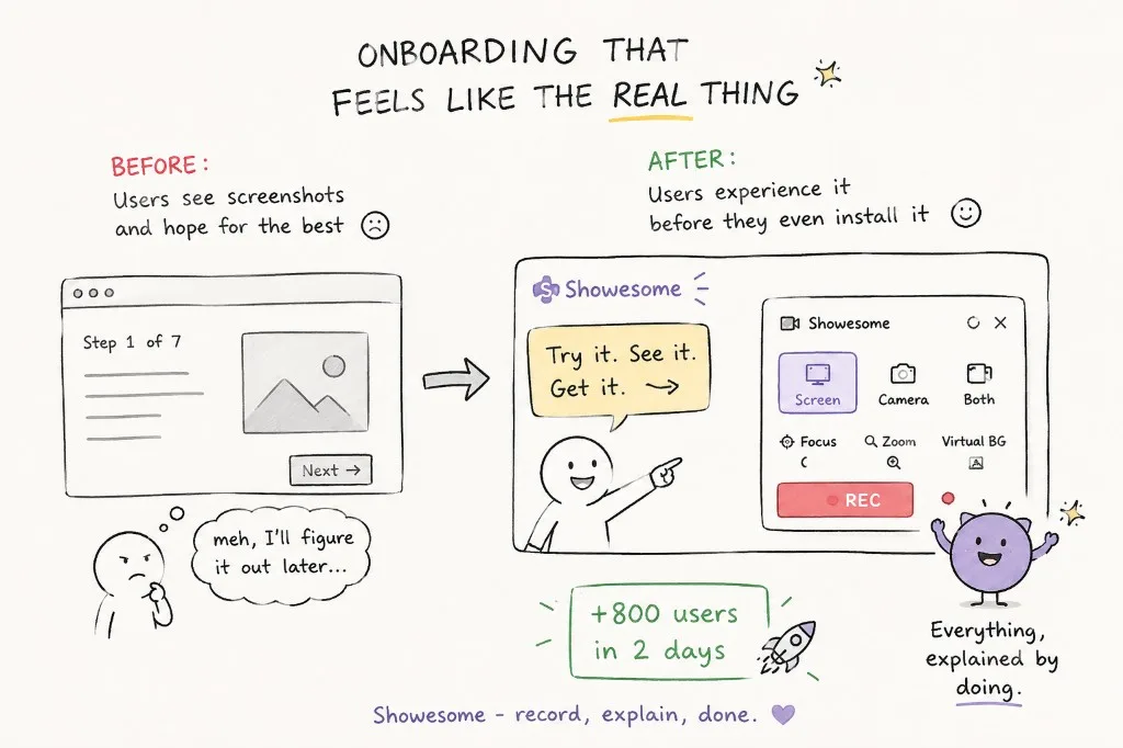
Before vs after: screenshots vs the real UI
Static “Step 1 of 7” tours ask users to read screenshots and hope they remember later. That is fine for marketing — weak for a tool people need to use in the flow of work.
We moved toward onboarding that feels like the real product: try recording modes, see Focus Mode and virtual backgrounds in context, and understand controls before the first serious recording. The shift was simple to describe, hard to ship: everything, explained by doing — not everything, explained in a deck.
What worked: show the real UI
We built Getting Started as an interactive tour over the actual extension: recording modes, mic and camera, bubble placement, virtual background, focus mode, settings, and recordings.
Users see the same controls they will use later — not abstract illustrations that do not match the product. When onboarding runs on the marketing site, people can experience the flow before they install — which helped discovery and signups in early tests. For a narrated walkthrough of mic setup and the first recording, see the quick start watch page.
Why interactivity mattered
Reading “you can spotlight elements” is weak. Clicking through a step that mirrors the real popup is strong. Discoverability improved because finding and trying happened in one flow.
What we did not do
We did not add popups on every visit. We did not force a ten-minute tour before the first recording. The tour is there when someone wants depth; the default path stays fast for quick captures.
Lessons for other products
- Onboarding should reference real UI, especially for browser tools
- Pair “simple first run” with an obvious path to power features
- Treat missing discovery as a product bug, not a documentation task
What changed in Showesome onboarding to improve feature discovery?
Interactive Getting Started replaced a static checklist. Users try modes, Focus Mode, and backgrounds on real UI instead of reading feature names in a list.
Can I try Showesome before installing the extension?
The website tutorials demo Focus Mode and flows in the browser. Full recording still requires the Chrome extension from the Web Store.
Does Showesome force a long tour before my first recording?
No — you can skip to recording anytime. Getting Started is there when you want a guided pass; pin the extension and record when you are ready.
Related reading
- Why discoverability matters more than simplicity
- Focus Mode tips once you know where to find it
Was this guide helpful?
One vote per browser. No account required.
Be the first to share feedback.
Comments
Join the discussion — comments are moderated to keep things helpful. Be respectful and constructive.
Preparing sign-in…