Why discoverability matters more than simplicity in product UX
Users often miss powerful features not because your product is complex — but because they never find them. Lessons from building Showesome.
One of the strangest product lessons from building Showesome was realizing that users can completely miss valuable features even when the UI feels simple and uncluttered.
Early feedback on Showesome was polite but revealing: people liked the recorder, then asked where features lived. Focus Mode. Virtual backgrounds. Settings panels. The tools were there — discovery was the gap.
Simplicity is not the same as findability
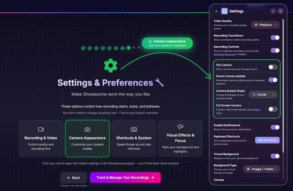
A minimal popup feels simple. It can also hide capability. When advanced features live behind icons users never click, “simple” becomes “incomplete” in practice.
Users do not read — they scan
Most people install a Chrome extension and try the obvious path: pick a mode, hit record. They do not study every row in settings. If a feature is not visible in the first session, it may as well not exist.
Hidden power creates support debt
When Focus Mode is hard to find, you get questions that sound like bugs: “Can you zoom?” “Can you highlight a button?” The answer was yes — the path to it was not obvious.
What we changed
We invested in interactive onboarding and clearer paths into Getting Started: real controls, real screenshots, step-by-step tours for modes, bubble behavior, virtual background, focus mode, and recordings.
The goal was not adding more interface clutter. It was showing the product while teaching it — so discoverability and simplicity work together.
Once onboarding explicitly demonstrated Focus Mode, users started using spotlight and zoom almost immediately — not because the capability was new, but because they finally saw where it lived.
Feature adoption is a design problem
Marketing can explain Focus Mode. Onboarding has to surface it at the moment someone might need it. That is especially true for screen recorders, where users arrive with one job (“record this tab”) and leave before they explore.
Takeaways for builders
- Map the features users miss, not just the ones they complain about
- Test whether first-time flows mention your differentiators by name
- Prefer guided tours over dense docs for visual products
- Measure discovery, not just signups
Why did users miss Focus Mode even though Showesome felt simple?
A minimal popup hid power features. Focus Mode and virtual backgrounds existed but were not obvious from the default UI — users assumed the recorder only captured pixels.
How does Showesome onboarding help users discover features?
Interactive Getting Started walks real extension UI — modes, Focus Mode, backgrounds, and settings — so features are tried in context instead of buried in menus.
Is a minimal extension popup always better for a screen recorder?
Not when tutorials need guided attention. Simplicity helps first launch; discoverability matters once users want clearer walkthroughs without editing.
Related reading
Was this guide helpful?
One vote per browser. No account required.
Be the first to share feedback.
Comments
Join the discussion — comments are moderated to keep things helpful. Be respectful and constructive.
Preparing sign-in…